When I visit a page about a voice agent, I also want to see what happens after the conversation. Where does the request go? Which information is checked? When does a person need to take over? I built Talveniq's page structure around those questions.
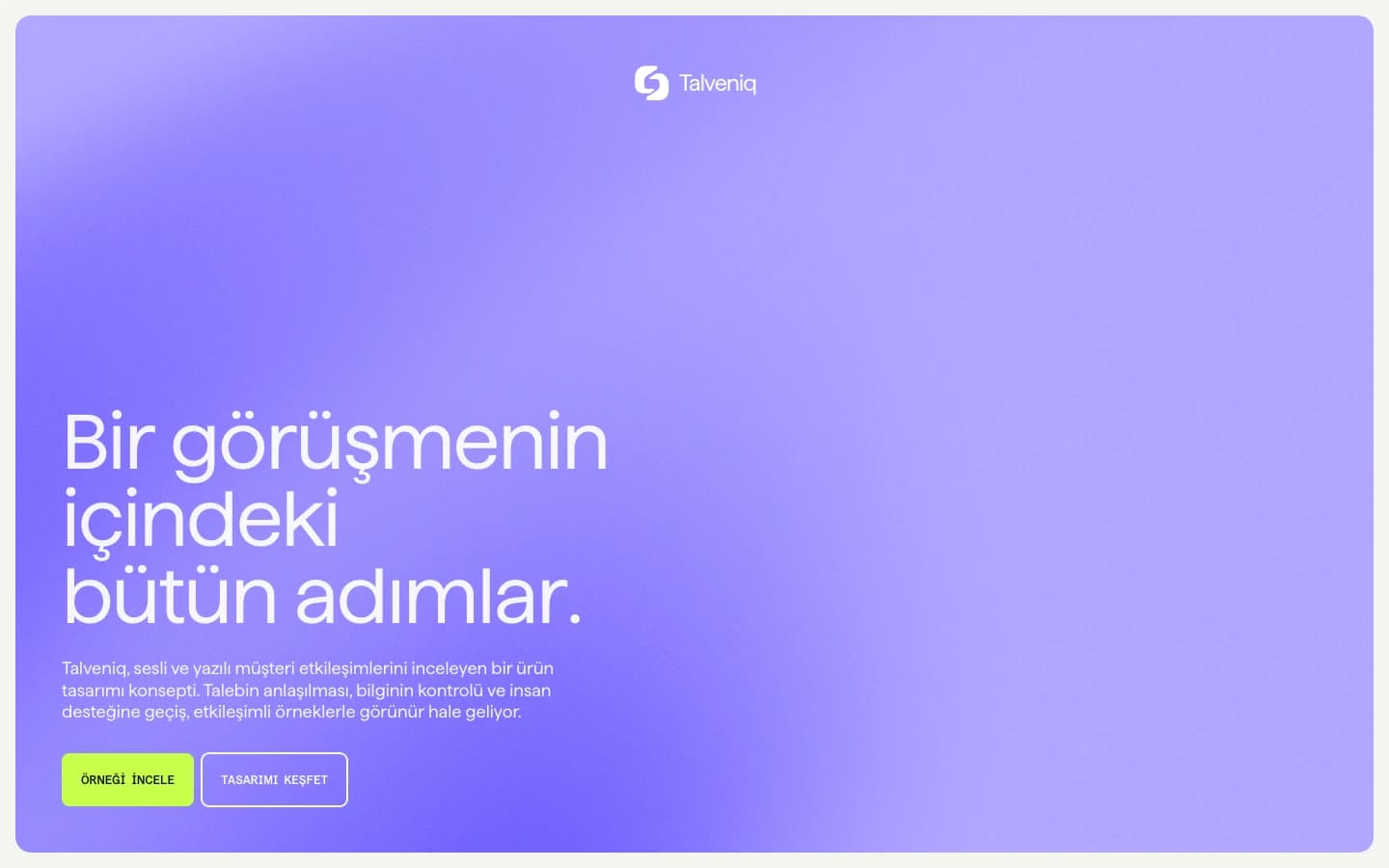
I turned the idea of voice and text agents into examples that can be followed step by step on screen. I developed a separate identity for the project, from the name and symbol to the colours and product views. I wanted visitors to understand what they were looking at, then move into the product page to try the flow.
Separating the homepage and product page
I opened the homepage with the customer-operation need, then explained how a request would be understood, which information it would need and how the next step would appear. I placed scenarios and common questions after that explanation.
On the product page, I prepared screens for closer inspection. I gave voice and text flows separate surfaces and added transitions between the states of a support conversation. I wanted someone arriving from the general introduction to be able to focus on a specific example.
I linked the main button to the product example and the secondary link to the section explaining how the design works. That gave visitors different routes depending on whether they wanted to try the interface immediately or read the detail first.
01 / IdentityTalveniq.
I drew the symbol with two closed SVG paths.
02 / Colour
#111318#F4F5EF#6C5CFF#C6FF4A#D9DCE5
03 / Behaviour
I used the same symbol in the conversation flow.
How I designed the logo
I explored the abstract symbol through image generation, then redrew the chosen form as an editable SVG with two closed paths. I retained the opening between the parts and checked that the shape held together at icon size.
I wanted to use violet and lime together. I assigned violet to broad brand surfaces and lime to prominent actions. I used dark ink for longer text and a light background between product views. I placed the same symbol at different scales in navigation, conversation screens and the footer.
My colour and typography decisions
When reducing the symbol, I first looked at the gap between its two parts. Closing that opening changed their relationship, so I kept the proportions around it when preparing the SVG. Being able to adjust colour and scale from the same file also simplified implementation.
I did not give violet and lime equal weight. I used violet across large areas, keeping lime for buttons and details I wanted to draw attention to. I left product surfaces lighter to make room for explanations and small interface labels, choosing light or dark versions of the symbol to suit each background.
For typography, I worked with the Haffer family's heading, body and mono treatments. I used large headings to introduce each section and a tighter arrangement for short state lines and labels within the conversation screen. That let me keep broad colour fields and small product details within the same design.
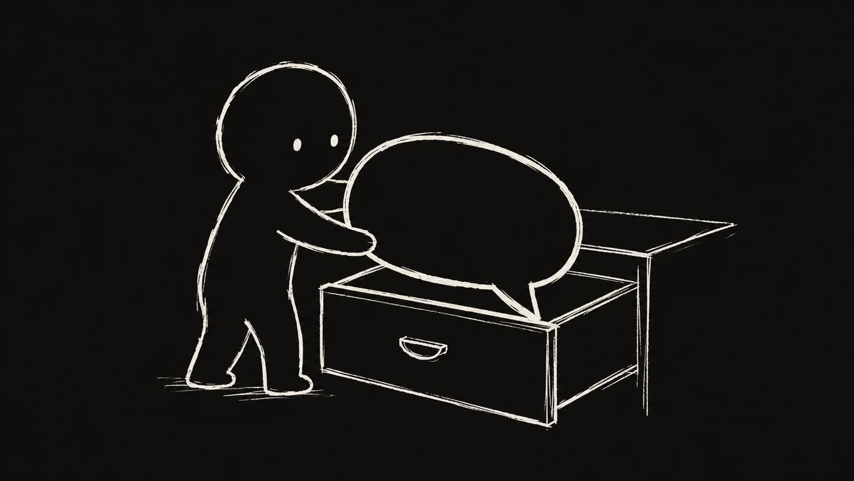
I used this drawing to explore a request passing into its next step.
How I prepared the example flows
I wanted visitors to be able to inspect more than an explanation of the idea. I brought a support conversation, text examples and interface studies for system connections together on the product page. The homepage's main button leads directly to that example.
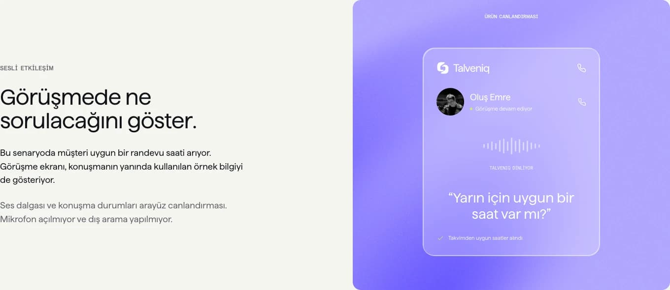
I built the conversation as a browser-based simulation with sample profile and record data. This let me show what a voice conversation could look like and how the information passed to a team could be organised. I added selectable states so each screen could be inspected separately.
Dividing the support conversation into five steps
I built the example around someone who cannot access their account. The first screen shows the incoming call and caller profile. In the next step I put the problem into text. The context screen brings together the sample profile, account status and previous-request checks.
In the record step, I showed the support entry and a summary for the technical team. In the final screen, I explained where the conversation had arrived. I preferred to introduce information as the conversation progressed instead of fitting every detail into the same phone mockup.
I made a visual distinction between finding information and still checking it. I also treated a handoff to the team as a separate state. When designing these differences, I kept asking whether I could tell what was happening from the screen. I used the same sample data throughout to maintain the relationship between steps.
The conversation flow I prepared with sample data on the product page.
Motion and the mobile layout
I used the wave background to bring movement into the broad colour field, placing product views and glass surfaces above it. When adjusting the glass effect, I paid attention to text readability, particularly small labels that could blend into the background.
I arranged staggered headings around the reading order of each section. Within the conversation example, I used motion to explain a state change. I wanted the transition from one screen to the next to be easy to follow, so I gave section entrances and product transitions different rhythms.
On narrow screens, I stacked side-by-side content and adjusted heading line breaks. I also included reduced-motion support, showing content without waiting for its entrance animation when that preference is enabled. I kept scenario selection and FAQ controls accessible in the mobile layout.
My browser checks
I opened the homepage and product page in desktop and narrow viewports. I followed the main button to the product example, changed scenario steps and opened and closed the FAQ. I saw no horizontal overflow or page errors in those journeys.
I also checked the violet and lime colour values, the SVG symbol on different surfaces and the text layout on small screens. I took the screenshots here from the working site. In the identity board I brought together the logo, palette and symbol usage; in the textless illustration I explored a conversation being passed into its next step.
Next, I want to watch where someone trying the flow for the first time hesitates. I am particularly interested in what information they might miss between the context screen and the record step, so I can refine that part of the product explanation.